How to use Scriptable Widgets
level: advanced, duration: 15 min
This tutorial focusses on working with the scriptable widgets. It highlights the functions of the ‘Category Chart’, ‘Histogram’, ‘XY Chart’ and ‘Bubble Chart’ widgets based on example data generated in the Let’s make a Molecule Archive and Let’s calculate the variance tutorials. Please complete these tutorials first before continuing with this tutorial to understand the data set and use the main functions of Mars. Alternatively, download the ‘TestVideo_archive_var.yama’ Molecule Archive from the git tutorials repository.
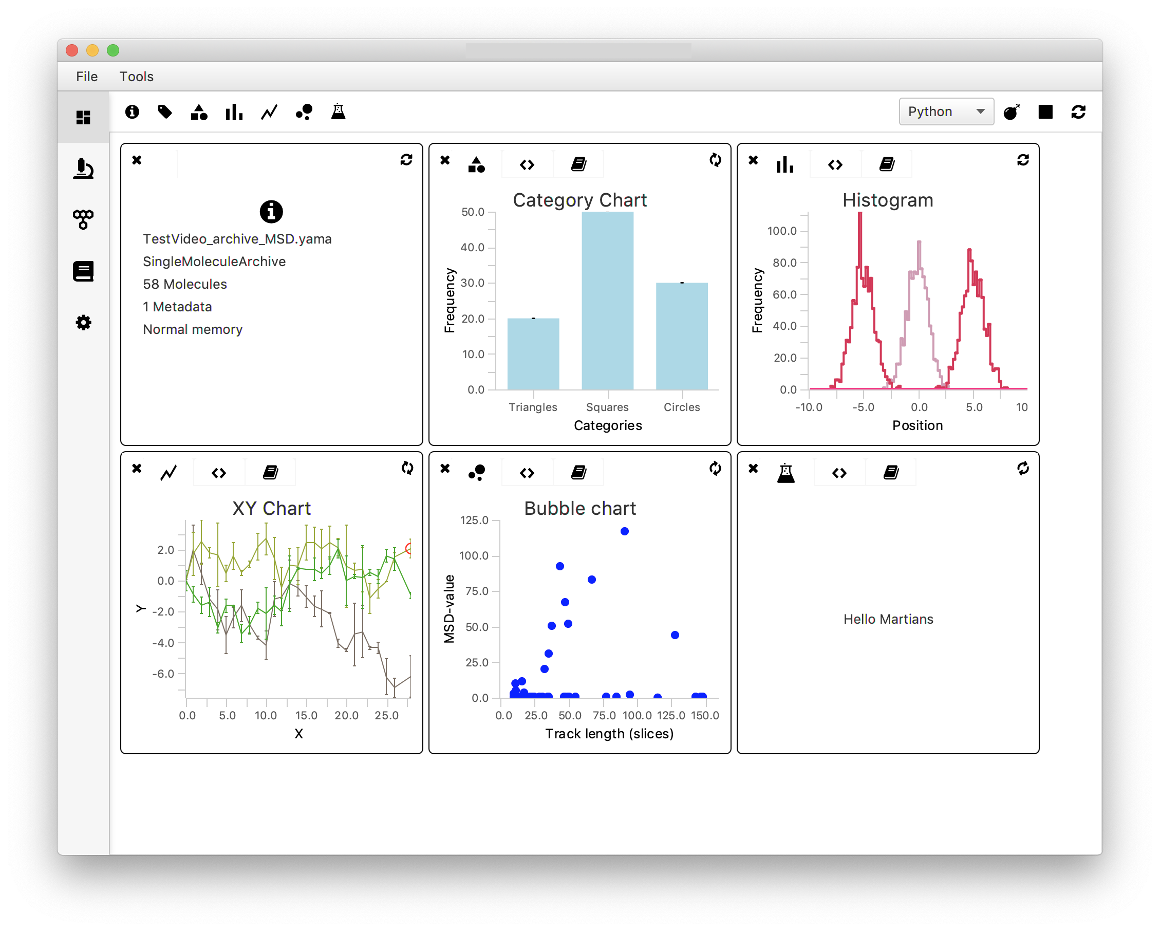
In the upcoming sections all four scriptable widgets are described with an example. These sections are not dependent on each other and can be completed independent of each other. Please note that the fifth scriptable widget ‘Beaker’ is not addressed in this tutorial. The ‘Beaker’ widget gives complete freedom to the user to script anything that is desired - from showing a weather prediction to creating a fully customised chart specific to a data type of interest. For more documentation on the widgets please visit the documentation section.
1. Category Chart - Plot the Mean Variance Value vs. Tag
Introduction
To gain insight in the relationship between the variance (var) and the assigned group (tag: ‘Active’ or no tag) a category chart is used. It plots the mean variance value of both groups as a bar plot. This gives a first glance at the relation between variance and tag category. Note that for a more thorough analysis of this relationship the reader is referred to the Open a Molecule Archive in Python tutorial.
To make the plot, the script first has to make two categories: ‘Active’-tagged molecules and molecules without a tag. Next, the var values of all molecules in their respective groups are collected in a list followed by the calculation of the mean of that list. These mean values are provided as the yvalues, the categories as the xvalues.
How to
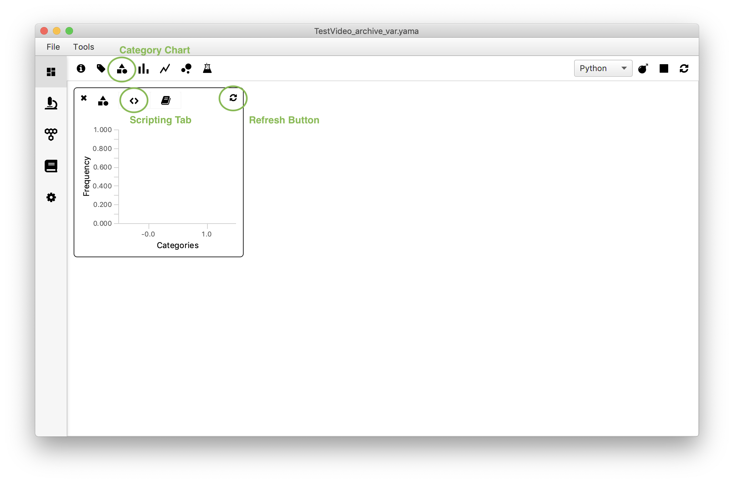
First, open the Category Chart widget in the Rover Dashboard toolbar. Switch to the script tab (<>) and replace the example script with the script below. Make sure to insert the correct parameter name (in this example: ‘var’). Press the refresh button to load the plot. Switch back to the plot tab.
#@ MoleculeArchive archive
#@OUTPUT String xlabel
#@OUTPUT String ylabel
#@OUTPUT String color
#@OUTPUT String title
#@OUTPUT String[] xvalues
#@OUTPUT Double[] yvalues
#@OUTPUT Double ymin
#@OUTPUT Double ymax

color = "#add8e6"
title = "Category Chart"
xlabel = "Categories"
ylabel = "Mean var value"
ymin = 0.0
ymax = 60.0

xvalues = ['Active','NotActive'] #Name the categories to be displayed
list1 = []
list2 = []

for UID in archive.getMoleculeUIDs():
    if archive.get(UID).hasTag('Active'): #Check if an entry is tagged 'Active'
        list1.append(archive.get(UID).getParameter('var')) #Make a list of var values
    else:
        list2.append(archive.get(UID).getParameter('var')) #Make a list of var values for untagged molecules
yvalues=[sum(list1)/len(list1),sum(list2)/len(list2)] #Define the yvalues as the means of both lists
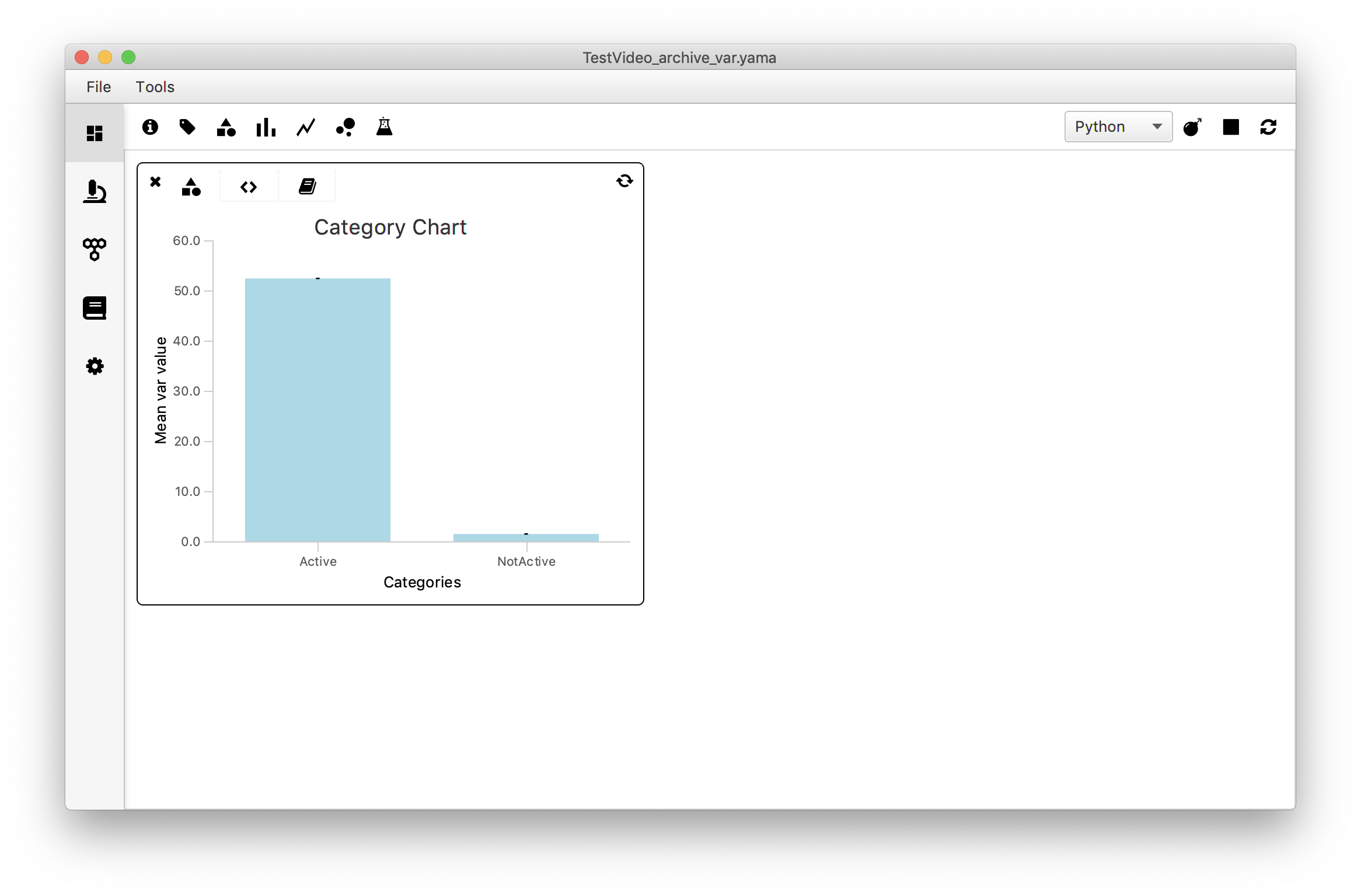
There seems to be a clear difference in the variance values in both categories. This was to be expected: active molecules are expected to move quite some distance over the DNA during the experiment resulting in a larger variance, while not-Active molecules are expected to stay more or less in the same position resulting in a minimal variance.
2. Histogram - Plot a Histogram of variance values
Introduction
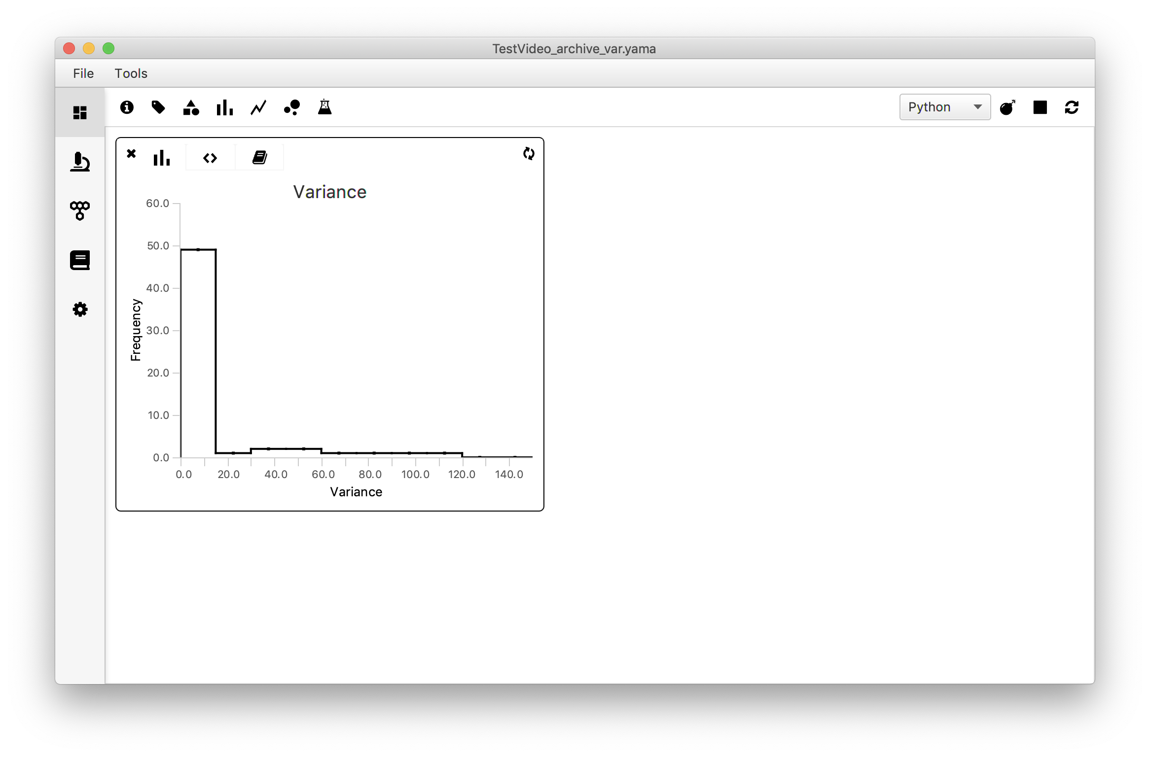
A histogram is a good way to familiarise oneself with the spread in the variance in the dataset. The frequency of occurrence of a certain value is plot against the value itself and gives a first indication of the presence of a certain distribution in the data.
The script for this histogram is fairly simple. After setting the global outputs the series1_values list is appended with the calculated variance of each molecule. This data is used to calculate the frequency of values internally to create the histogram. The data included in the figure can be selected by setting values for xmin and xmax. This enables the user to either include all data points by using xmin=min(var_values) and xmax=max(var_values) or selecting a smaller region of interest.
How to
Open the histogram widget in Rover dashboard by clicking on the icon in the toolbar. Move to the script tab (<>) and replace the example script with the script below. Make sure to adapt the script below to match the correct parameter name (in this example: ‘var’) and the desired xmin, xmax, ymin, ymax values. To display this histogram, click the refresh icon in the far right.
#@ MoleculeArchive archive
#@OUTPUT String xlabel
#@OUTPUT String ylabel
#@OUTPUT String title
#@OUTPUT Integer bins
#@OUTPUT Double xmin
#@OUTPUT Double xmax
#@OUTPUT Double ymin
#@OUTPUT Double ymax

# Set global outputs
xlabel = "Variance"
ylabel = "Frequency"
title = "Variance"
bins = 10
xmin = 0.0
xmax = 150.0
ymin = 0.0
ymax = 60.0

# Series 1 Outputs
#@OUTPUT Double[] series1_values
#@OUTPUT String series1_strokeColor
#@OUTPUT Integer series1_strokeWidth

series1_strokeColor = "black"
series1_strokeWidth = 2

series1_values = []

for molecule in archive.molecules().iterator():
    series1_values.append(molecule.getParameter("var"))
In the example dataset most tracked molecules have a variance below ~15. To explore the subset of the data with value <15 one can change the xmin and xmax values accordingly to show the histogram from for example x=0 to x=15. This is left for the reader as an exercise.
3. XY Chart - Plot all ‘Active’ Traces in one Figure
Introduction
To inspect whether all ‘Active’-tagged molecules behave similarly they are plotted in the same figure (y vs. slice) using the ‘XY Chart’ widget. As found in the Let’s calculate the Variance tutorial there were 10 molecules tagged ‘Active’.
The extended script consists of multiple parts:
- Input/Output section: since the scriptable widgets are based on the script parameters harvesting mechanism all specified inputs (the Molecule Archive) and outputs (all plot coordinates, plot metadata like colors and titles) have to be explicitly specified.
- Global outputs section: sets the plot metadata like labels, title and min and max coordinates.
- Make two lists with x and y coordinates: makes two lists containing all x and y coordinates of all traces tagged ‘Active’. Since these traces can start wherever on the field of view and do not all start at the same time (slice) these coordinates have to be adjusted to all start at y=0 and slice=0. This enables direct comparison between the traces.
- Define colors of the stroke, the fill, and strokewidth.
- Correct the x and y coordinates for each trace: correct by subtracting the min(slice) and min(y) respectively. This makes sure all traces start at slice=0 and y=0 in the plot. Note that since all output parameters need to be assigned explicitly their values also need to be assigned explicitly. In this scripting environment it is impossible to use a script that assigns these values automatically using matrices.
How to
Open the ‘XY Chart’ widget and switch to the scripting tab (<>). Replace the example script by the script below. Press the refresh icon to render the plot. Note that in this example all error values are set to 0 since no error information is available.
#@ MoleculeArchive archive
#@OUTPUT String xlabel
#@OUTPUT String ylabel
#@OUTPUT String title
#@OUTPUT Double xmin
#@OUTPUT Double xmax
#@OUTPUT Double ymin
#@OUTPUT Double ymax

#@OUTPUT Double[] series1_xvalues
#@OUTPUT Double[] series1_yvalues
#@OUTPUT Double[] series1_error
#@OUTPUT Double[] series2_xvalues
#@OUTPUT Double[] series2_yvalues
#@OUTPUT Double[] series2_error
#@OUTPUT Double[] series3_xvalues
#@OUTPUT Double[] series3_yvalues
#@OUTPUT Double[] series3_error
#@OUTPUT Double[] series4_xvalues
#@OUTPUT Double[] series4_yvalues
#@OUTPUT Double[] series4_error
#@OUTPUT Double[] series5_xvalues
#@OUTPUT Double[] series5_yvalues
#@OUTPUT Double[] series5_error
#@OUTPUT Double[] series6_xvalues
#@OUTPUT Double[] series6_yvalues
#@OUTPUT Double[] series6_error
#@OUTPUT Double[] series7_xvalues
#@OUTPUT Double[] series7_yvalues
#@OUTPUT Double[] series7_error
#@OUTPUT Double[] series8_xvalues
#@OUTPUT Double[] series8_yvalues
#@OUTPUT Double[] series8_error
#@OUTPUT Double[] series9_xvalues
#@OUTPUT Double[] series9_yvalues
#@OUTPUT Double[] series9_error
#@OUTPUT Double[] series10_xvalues
#@OUTPUT Double[] series10_yvalues
#@OUTPUT Double[] series10_error

#@OUTPUT String series1_fillColor
#@OUTPUT String series1_strokeColor
#@OUTPUT Integer series1_strokeWidth
#@OUTPUT String series2_fillColor
#@OUTPUT String series2_strokeColor
#@OUTPUT Integer series2_strokeWidth
#@OUTPUT String series3_fillColor
#@OUTPUT String series3_strokeColor
#@OUTPUT Integer series3_strokeWidth
#@OUTPUT String series4_fillColor
#@OUTPUT String series4_strokeColor
#@OUTPUT Integer series4_strokeWidth
#@OUTPUT String series5_fillColor
#@OUTPUT String series5_strokeColor
#@OUTPUT Integer series5_strokeWidth
#@OUTPUT String series6_fillColor
#@OUTPUT String series6_strokeColor
#@OUTPUT Integer series6_strokeWidth
#@OUTPUT String series7_fillColor
#@OUTPUT String series7_strokeColor
#@OUTPUT Integer series7_strokeWidth
#@OUTPUT String series8_fillColor
#@OUTPUT String series8_strokeColor
#@OUTPUT Integer series8_strokeWidth
#@OUTPUT String series9_fillColor
#@OUTPUT String series9_strokeColor
#@OUTPUT Integer series9_strokeWidth
#@OUTPUT String series10_fillColor
#@OUTPUT String series10_strokeColor
#@OUTPUT Integer series10_strokeWidth

# Set global outputs
xlabel = "Time point (T)"
ylabel = "Displacement (Y)"
title = "XY Chart"
xmin = 0.0
xmax = 150
ymin = 0.0
ymax = 35

# Make two lists containing the lists of x and y coordinates of the molecules tagged 'Active'
list1_x=[]
list1_y=[]

for UID in archive.getMoleculeUIDs():
    if archive.get(UID).hasTag('Active'):
        list1_x.append(archive.get(UID).getTable().getColumnAsDoubles("T"))
        list1_y.append(archive.get(UID).getTable().getColumnAsDoubles("Y"))

# Since all variables have to be explicitly defined, always adjust this part based on the amount of tagged molecules.
series1_xvalues = []
series1_yvalues = []
series2_xvalues = []
series2_yvalues = []
series3_xvalues = []
series3_yvalues = []
series4_xvalues = []
series4_yvalues = []
series5_xvalues = []
series5_yvalues = []
series6_xvalues = []
series6_yvalues = []
series7_xvalues = []
series7_yvalues = []
series8_xvalues = []
series8_yvalues = []
series9_xvalues = []
series9_yvalues = []
series10_xvalues = []
series10_yvalues = []

# Define the colors of the stroke, the fill, and strokewidth
[series1_strokeColor,series2_strokeColor,series3_strokeColor,series4_strokeColor,series5_strokeColor, series6_strokeColor,series7_strokeColor,series8_strokeColor,series9_strokeColor,series10_strokeColor]=["black","blue","red","green","yellow","cyan","orange","violet","pink","gray"]

[series1_fillColor,series2_fillColor,series3_fillColor,series4_fillColor,series5_fillColor,series6_fillColor,
series7_fillColor,series8_fillColor,series9_fillColor,series10_fillColor]= [series1_strokeColor,series2_strokeColor,series3_strokeColor,series4_strokeColor,series5_strokeColor, series6_strokeColor,series7_strokeColor,series8_strokeColor,series9_strokeColor,series10_strokeColor]

[series1_strokeWidth,series2_strokeWidth,series3_strokeWidth,series4_strokeWidth,series5_strokeWidth,series6_strokeWidth, series7_strokeWidth,series8_strokeWidth,series9_strokeWidth,series10_strokeWidth]=[1,1,1,1,1,1,1,1,1,1]

# Assign the x and y values for each trace
for i in list1_x[0]:
    series1_xvalues.append(i-min(list1_x[0]))
for i in list1_y[0]:
    series1_yvalues.append(i-min(list1_y[0]))
series1_error = [0]*len(series1_yvalues)

for i in list1_x[1]:
    series2_xvalues.append(i-min(list1_x[1]))
for i in list1_y[1]:
    series2_yvalues.append(i-min(list1_y[1]))
series2_error = [0]*len(series2_yvalues)

for i in list1_x[2]:
    series3_xvalues.append(i-min(list1_x[2]))
for i in list1_y[2]:
    series3_yvalues.append(i-min(list1_y[2]))
series3_error = [0]*len(series3_yvalues)

for i in list1_x[3]:
    series4_xvalues.append(i-min(list1_x[3]))
for i in list1_y[3]:
    series4_yvalues.append(i-min(list1_y[3]))
series4_error = [0]*len(series4_yvalues)

for i in list1_x[4]:
    series5_xvalues.append(i-min(list1_x[4]))
for i in list1_y[4]:
    series5_yvalues.append(i-min(list1_y[4]))
series5_error = [0]*len(series5_yvalues)

for i in list1_x[5]:
    series6_xvalues.append(i-min(list1_x[5]))
for i in list1_y[5]:
    series6_yvalues.append(i-min(list1_y[5]))
series6_error = [0]*len(series6_yvalues)

for i in list1_x[6]:
    series7_xvalues.append(i-min(list1_x[6]))
for i in list1_y[6]:
    series7_yvalues.append(i-min(list1_y[6]))
series7_error = [0]*len(series7_yvalues)

for i in list1_x[7]:
    series8_xvalues.append(i-min(list1_x[7]))
for i in list1_y[7]:
    series8_yvalues.append(i-min(list1_y[7]))
series8_error = [0]*len(series8_yvalues)

for i in list1_x[8]:
    series9_xvalues.append(i-min(list1_x[8]))
for i in list1_y[8]:
    series9_yvalues.append(i-min(list1_y[8]))
series9_error = [0]*len(series9_yvalues)

for i in list1_x[9]:
    series10_xvalues.append(i-min(list1_x[9]))
for i in list1_y[9]:
    series10_yvalues.append(i-min(list1_y[9]))
series10_error = [0]*len(series10_yvalues)
The plot shows that all traces have a similar slope but vary in their tracked length.
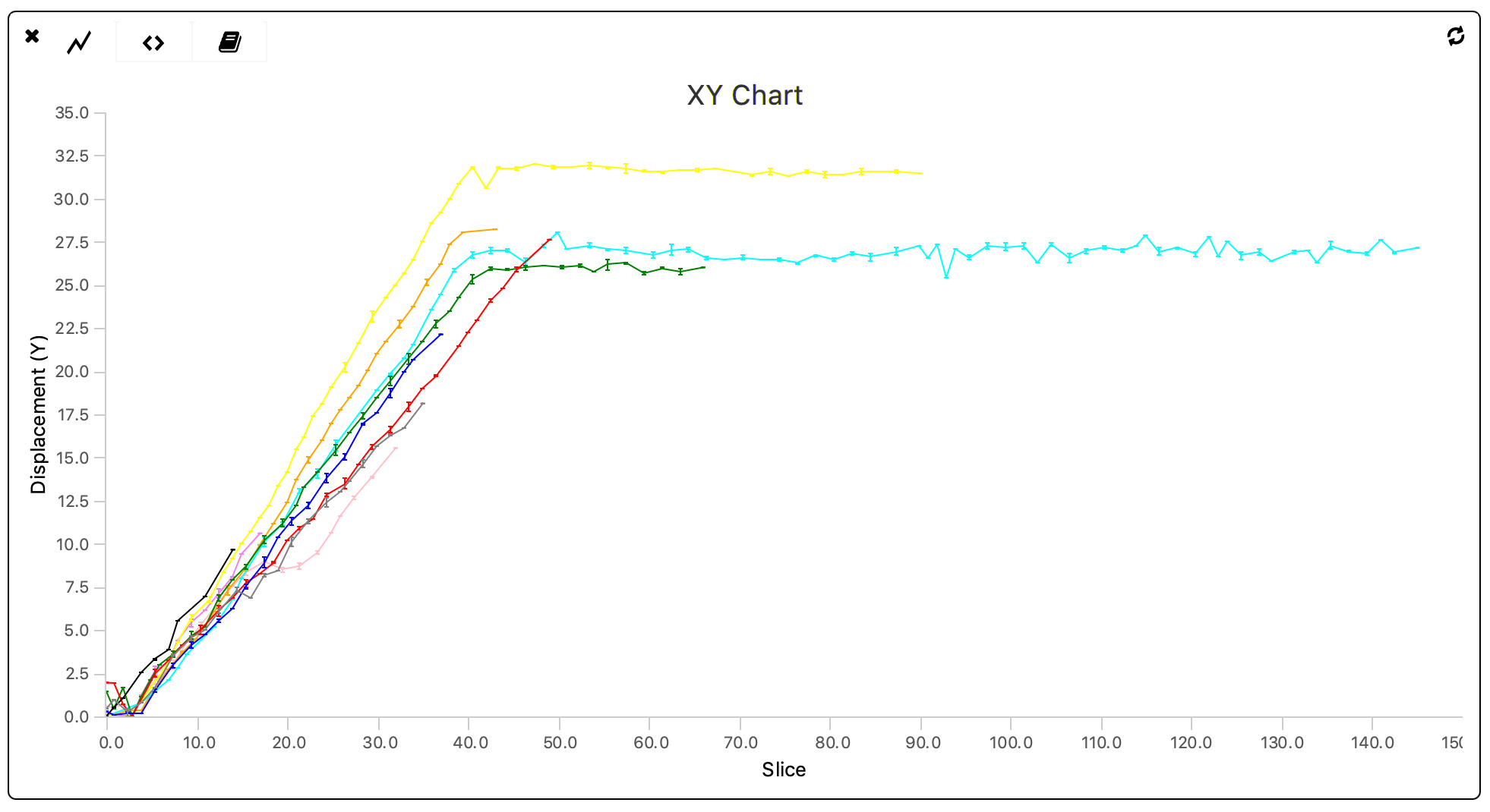
When dealing with larger datasets the code displayed above should be converted to an automated version in which all series-specific values are assigned automatically. This is left as an exercise to the reader.
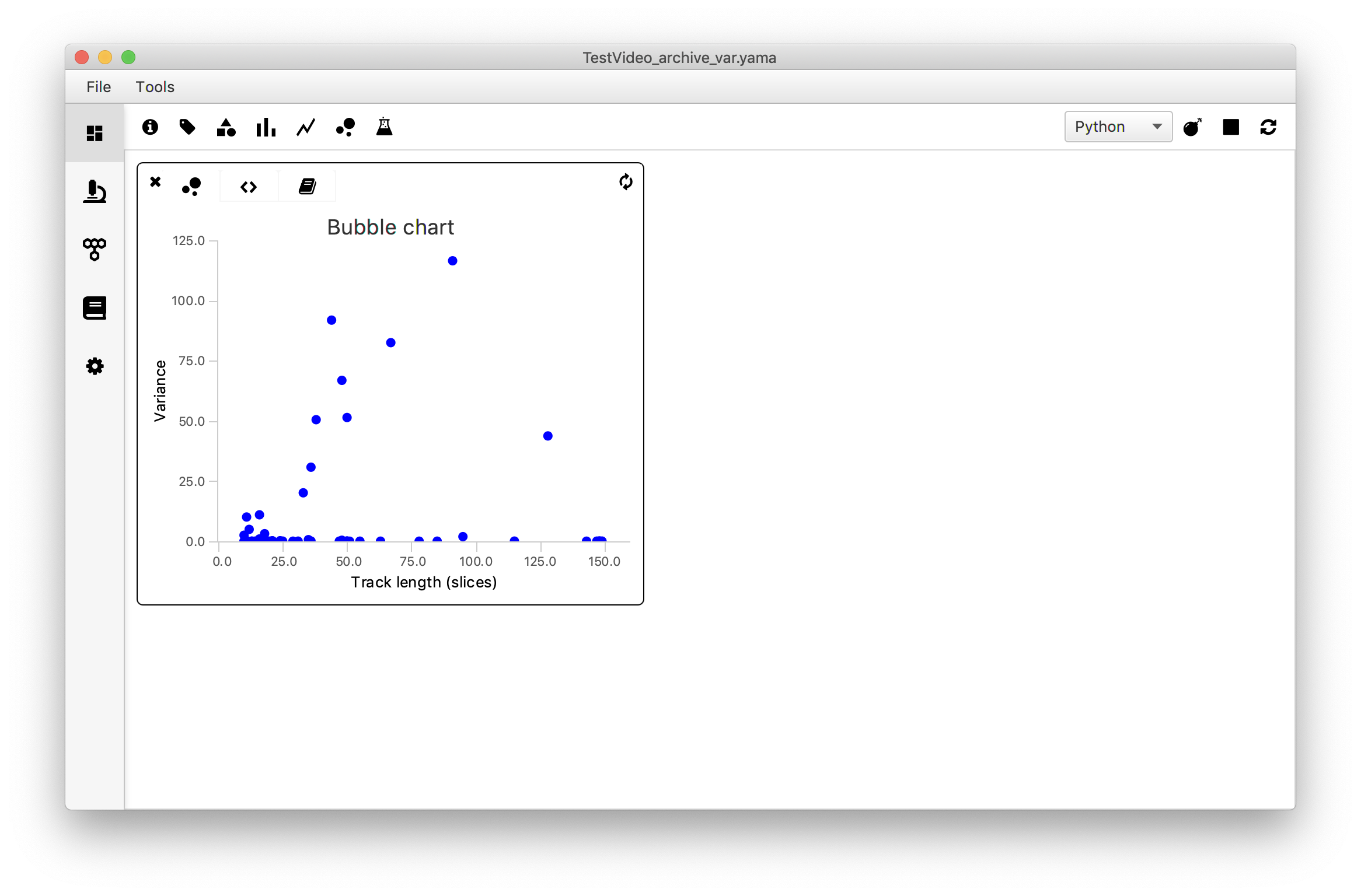
4. Bubble Chart - Plot the variance vs. Track Length
Introduction
To answer the question ‘Are longer tracks associated with higher variances?’ the variance of each molecule is plotted against the track length using the ‘Bubble Chart’ widget. To do so, the track length is provided as xvalues in the script and the var values as yvalues of the series. As an extra feature the molecule UIDs are provided in the series1_label list in the last line of the code. This ensures that when moving the mouse to a datapoint in the plot the corresponding UID is shown.
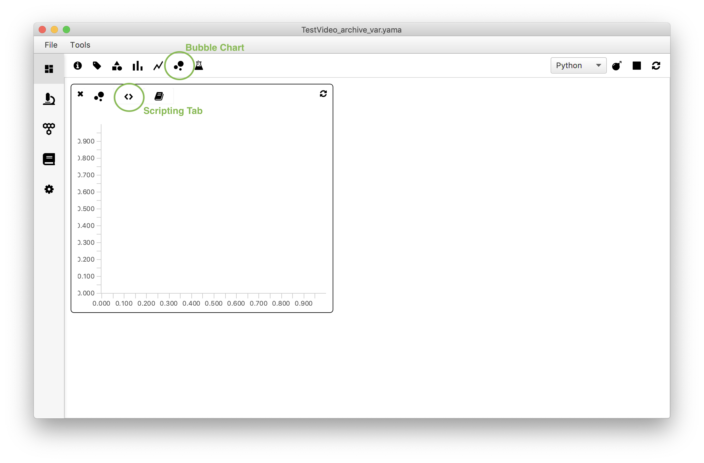
How to
Open the ‘Bubble Chart’ widget in the Rover dashboard toolbar and move to the script tab (<>). Replace the example script by the script below and make sure to adjust the parameter name to match the name in the archive (in this example: ‘var’). Press the refresh icon to render the plot.
#@ MoleculeArchive archive
#@OUTPUT String xlabel
#@OUTPUT String ylabel
#@OUTPUT String title
#@OUTPUT Double xmin
#@OUTPUT Double xmax
#@OUTPUT Double ymin
#@OUTPUT Double ymax

# Set global outputs
xlabel = "Track length (T)"
ylabel = "Variance"
title = "Bubble chart"

xmin = 0.0
xmax = 160
ymin = 0.0
ymax = 125

# Series 1 Outputs
#@OUTPUT Double[] series1_xvalues
#@OUTPUT Double[] series1_yvalues
#@OUTPUT Double[] series1_size
#@OUTPUT String[] series1_label
#@OUTPUT String[] series1_color
#@OUTPUT String series1_markerColor

series1_markerColor = "lightgreen"

series1_xvalues = []
series1_yvalues = []
series1_size = []
series1_color = []
series1_label = []

for molecule in archive.molecules().iterator():
	series1_xvalues.append(molecule.getTable().getRowCount()) #Make a list of track lengths
	series1_yvalues.append(molecule.getParameter("var")) #Make a list of var values
	series1_size.append(4.0)
	series1_color.append("blue")
	series1_label.append(molecule.getUID()) #Make a list of the UIDs